


Introduction
In CSS there are so many units but many people use px(pixels) in the beginning. If you learn CSS a little bit more you will come to know that there are tons of different CSS units. The most common CSS unit which every developer prefers to use is the rem unit we will look into it in detail in this blog.
In CSS there are two types of a length units.
- Absolute length units
- Relative length units
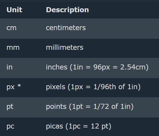
Absolute lengths
What are Absolute length units ?
The absolute length units are fixed and a length expressed in any of these will appear as exactly that size. We can also call them Fixed units. This Absolute length units stay the same size, no matter the circumstances. For example, if we gave a width of 10px to any div it always is the same. However, other units such as vw,vh and em can change.
You can try out all of the above units on your demo page it is simple it doesn't have that much explanation.
Relative length units
Relative units can change because they are relative to another length. This means that lengths such as 2vw will be different sizes depending on the length of their reference. Relative length units are relative to something else, perhaps the size of the parent element's font, or the size of the viewport.
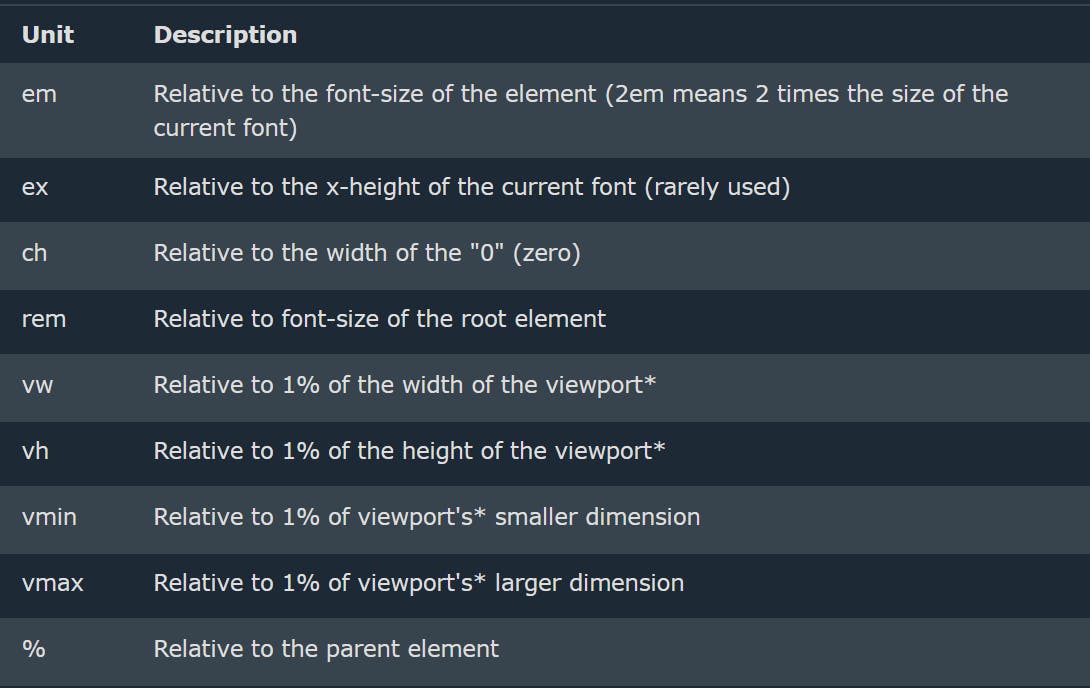
These are the most common units which you will be using in your web development journey. Let's understand all of them step by step.
1 - em
Unit em will be relative to the font size of the element (2em means 2 times the size of the current font). em units are relative to the font size of the element. For example, let’s say we have a div and we want to set the height to 3em - that means we are setting it three times its font size.
2 - rem
rem units are the units that you can use anywhere inside your CSS and it will take root font size which is 16px that's what rem is let's compare rem and em for better understanding.
rem vs em
Let's understand the difference with an example.
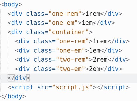
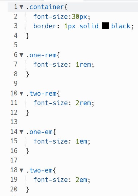
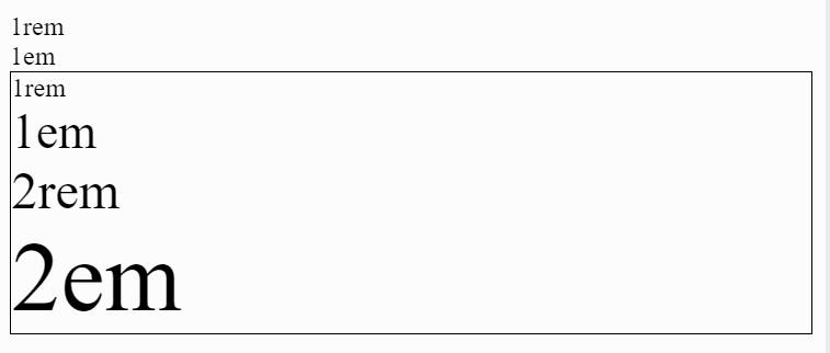
In the above code as you can see the HTML element which is out of the container class div take rem and em as 16px as root font size (root font size means by default coming from html tag) but when a container has font size as 30px then the 1rem is still same in container box but you can see 1em has seemed to be larger than 1rem because 1rem is taking root font size which is 16px and 1em is taking its parent font size which is 30px this is the difference between em and rem.
This is codesandbox link of above example : rem vs em link
3 - percent(%)
The percentage unit will be always relative to the parent element. Let suppose we gave 300% font-size to a div then it will take font-size as 48px becuse root font-size is 16px and 100% means 16px here so, 16px × 3 = 48px so thats how percent unit works.
4 - vh and vw
- vw = Relative to 1% of the width of the viewport
- vh = Relative to 1% of the height of the viewport
viewport means browser window (not including the tabs etc.) the actual website part of the screen.
Let's understand vh, vw, and percent units with an example,
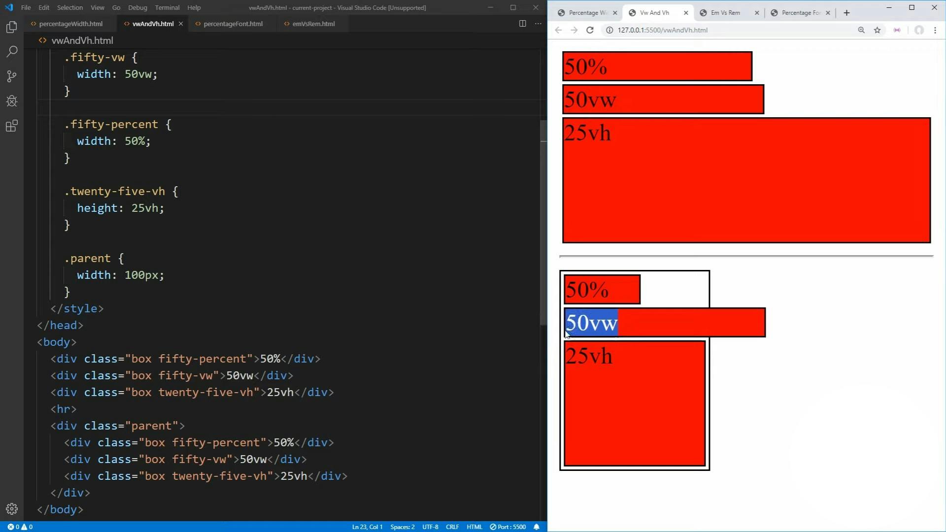
Percent vs (vh and vw)
As we can see in the above code fifty-percent class means fifty percent of the width but when we see inside the parent div we can see that the fifty-percent css class applied div gets only 50% of the width of the parent element which is 100px means in parent div the div containing class name fifty-percent is taking 50% of 100px which is 50px that's how percent unit works.
Outside of parent class div, we can see that there is a fifty-vw and twenty-five-vh class which has specific values as per their class names and you can see that even if inside div which has parent class we had same class name applied on div but it's exceeding the box size width which is 100px because vw and vh not work like percentage it takes 50vw of the screen where ever you use it doesn't matter it will take 50vh means 50% of the screen it doesn't relative to its parent width and height same with 25vh. That's how percent, vh, and vw units work behind the scenes.
5 - vmin and vmax
What vmin does is first it will compare vh and vw of that particular HTML element where vmin is applied in CSS and after comparing let's suppose vw is smaller then it will take particular vw and applied it in vmin that's how vmin works. In vmax, it will look for the highest vh and vw if vw is higher then it set vmax to that size that how vmin and vmax work.
Conclusion
This is small blog where I covered almost all CSS units if you read this blog carefully you will never get stuck around how different CSS units works and the most important part is to open your vs code and try all of these different CSS units then and then only you will understand it forever.
References - mdn docs